missingno
Visualizations, in my naive opinion, are the cornerstone to understanding what you are doing in data science. It is easy to quickly call something in your jupyter notebook and check you are handling the kind of the object you think you are. It gets a bit harder when it comes to visualizing your data. There are plenty of quick ways to see what the spread of your data, quantity, etc. A histogram does wonders. But what about the data you don’t have? Or you have some other piece of information that ties the data to the physical world (an address, lat/long, or even something more specific). There are a number of easy to implement libraries to help you see how your data set internal looks and mapped onto things.
missingno is my best tool in my tool belt for finding about NaN values in a dataset. There are plently of great tools to explore your data. When starting out on a project, your missing NaN values could be an important factor in making decisions and there is where missingno shines. This library “works by converting tabular data matrices into boolean masks based on whether individual entries contain data (which evaluates to true) or left empty (which evaluates to false).” (Bilogur) This “nullity matrix” is what is leveraged against the underlying packages NumPy, pandas, SciPy, matplotlib, and seaborn (Bilogur).
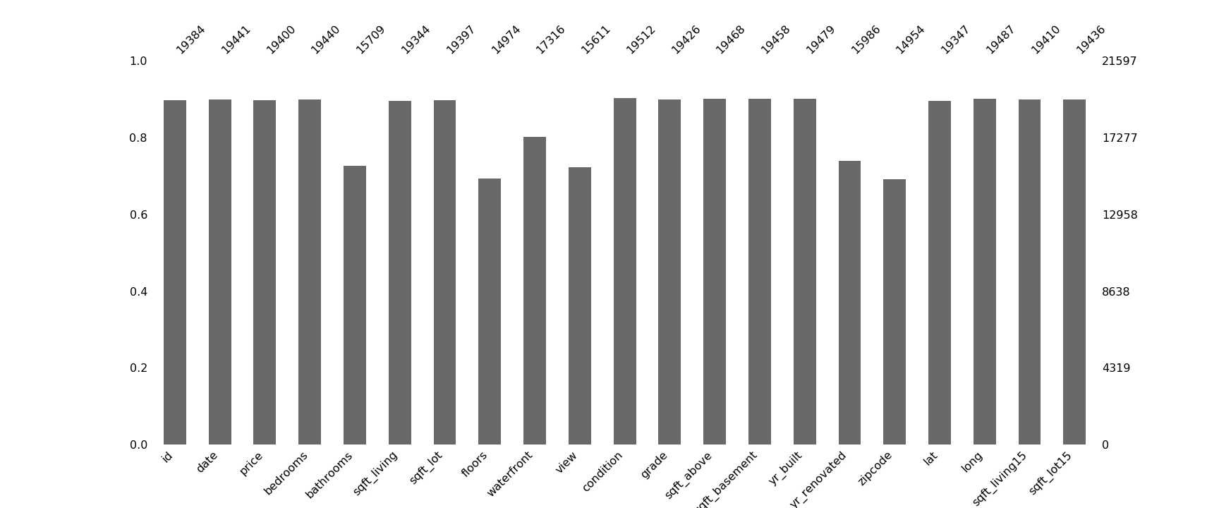
The first visualization is an easy one msno.bar. This returns a bar graph of the showing how much is missing from each column. This makes for comparing the missing data from different features easier while showing where there could be no data at all. You can quickly see in portion what data is missing and from where. As it looks, there is roughly the same amount of missing data across our dataset but we can’t see if there are any patterns to it.
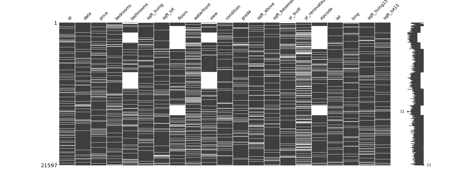
msno.matrix is a highlight of this library. This shows a visualization in the missing data by row. This can easily highlight if a certain row is consistently missing values, making the case to drop entire rows much stronger. Another strong utility of the matrix is to see patterns in the missing values. You can see if there is consistency when one variable it is skipped, another one is as well.
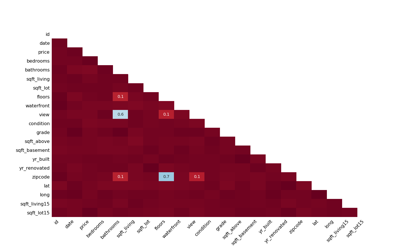
If there are patterns that you are unable to spot, due to either obscurity or some other reason, missingno can create a correlation heatmap. It will not display any variables that are always full or always empty. “Entries marked <1 or >-1 are have a correlation that is close to being exactingly negative or positive, but is still not quite perfectly so (Bilogur). This can point you towards some steps you can take to recreate the data or drop columns altogether. Take a look at their README for a good primer.
Going forward with missingno there are other things in our data that may be good to know before we set out. Some patterns are hard to check, specifically when it comes to modeling geographic data. The next few visualizations rely on geoplot and geopandas libraries. If you are a unfamiliar with these libraries or want to brush up, check them out.
Missingno can help plot your data as “a set of minimum-enclosure convex hulls”. A convex closure of a set X of points in the Euclidean plane or in a Euclidean space is the smallest convex set that contains X. For instance, when X is a bounded subset of the plane, the convex hull may be visualized as the shape enclosed by a rubber band stretched around X.(Wiki) The following uses a sample of the NYPD Motor Vehicle Collisions Dataset dataset. When latitude and longitude is paired with another geographic subset of data, zip codes, missinggo maps the values. The color gradient makes it easy to see if there is a physical area that has more missing data than other locations.
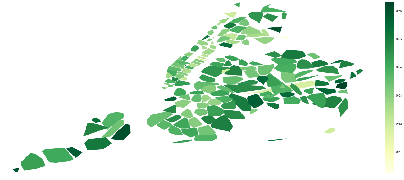
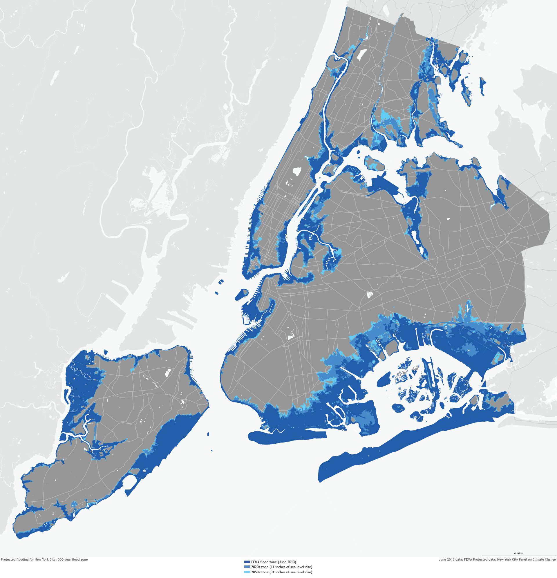
As you can see, with enough points you can reflect the geological area being mapped. Compare with the image of Manhattan below, courtesy of NOAA.
And while we aren’t all fortunate enough to have subsequent geographical information in our datasets, missingno can still compute a quadtree with the nullity distribution. ` msno.geoplot(collisions, x=’LONGITUDE’, y=’LATITUDE’)`
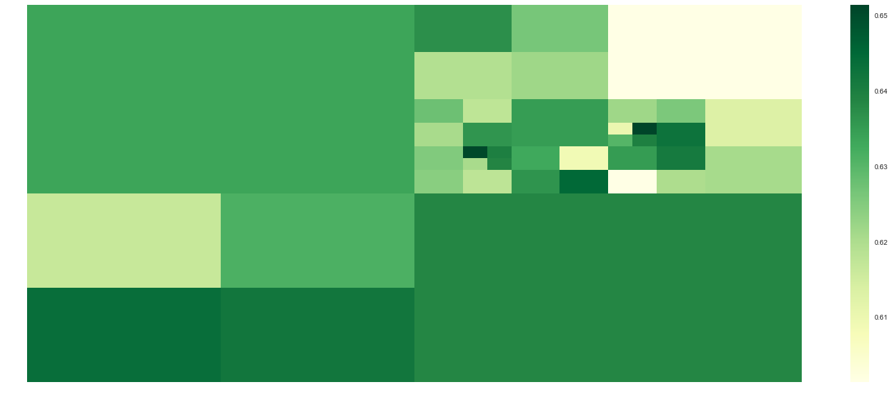
This will give us enough information to see if the NaN values are throughout our data or in specific regions.
So when starting out on your next data science project, make sur you have missinggo in your tool belt. It could just help you explain the unknown.
Citations and references:
https://en.wikipedia.org/wiki/Convex_hull
Bilogur, (2018). Missingno: a missing data visualization suite. Journal of Open Source Software, 3(22), 547, https://doi.org/10.21105/joss.00547